By Louise Treadwell
Using Color Contrast to Make Your Presentation Slides Accessible

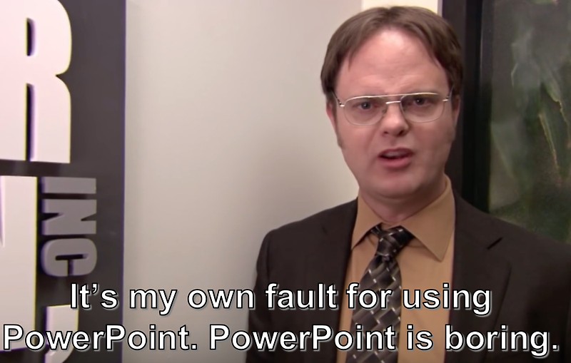
Your proposal was accepted, and you’ve been invited to give a talk at a WordCamp! Congratulations! Once you’ve finished doing a little happy dance, it is time to get down to business and start working on your slides. The gold standard for WordCamp presentations is to use Google Slides or PowerPoint (never mind what Dwight might think) or you can go further and be like Matt and use the WordPress 2020 theme! But regardless of what you use to build your slides, nothing matters if they aren’t clear, clean, and accessible.
The basic anatomy of an accessible presentation slide:
- Make your slides available online at the start of your presentation so that users can download them and follow along
- Use alt tags to describe your images, especially your infographics and memes
- Use descriptive language for your links instead of “click here.”
- User headers (H1, H2, etc.) to help users quickly navigate your content
- Use bullets to clearly designate your lists
- Use standard fonts instead of overly creative ones
Most of these issues are well-known, oft-discussed, and easily caught if you run the builtin accessibility checker provided inside of Microsoft’s PowerPoint. (You can find it under the “Review” menu header)
A commonly forgotten accessibility issue with presentation slides is color contrast. When there is not enough contrast between the color of your text and the color of your backgrounds, it can become difficult or even impossible for your audience to read your slides. Difficulty seeing color contrast is directly linked to color blindness, a condition that affects far more people than we realize.
According to the National Eye Institute, “There are three main kinds of color blindness, based on photopigment defects in the three different kinds of cones that respond to blue, green, and red light. Red-green color blindness is the most common, followed by blueyellow color blindness. A complete absence of color vision —total color blindness – is rare.”
Milder forms of color blindness are underreported by users because often many don’t even know they have it. But as any graphic designer or web designer can tell you, the topic comes up often in design meetings when someone points out that a button on a page or a border is missing. Then the team erupts into a debate, not unlike the internet frenzy over “The Dress.” (I’m team “blue and black,” by the way) The issue is usually that the “missing” button or border is so close in color to its background that it is rendered invisible to some users. This problem won’t be reported by most users because how they can tell you something is missing if they didn’t know it was supposed to be there???
So, if users can’t report it, how do we know if our color contrast is problematic?
Automated tools will tell us there is a color contrast problem but they usually don’t tell us explicitly how to fix it. (PowerPoint is guilty in this regard) The Web Content Accessibility Guidelines (WCAG) is a set of measurable and attainable benchmarks for achieving accessibility on the web. The WCAG has very precise rules for color usage. We can use those rules to help us create accessible presentation slides. Lucky for us, there are tools out there that are built to test those rules and help us make concrete design decisions.
Here are two of my favorites:
- WebAIM Contrast Checker – This online tool is very lightweight and straight to the point. Enter the HEX code for your foreground (text, borders, buttons) and then your background. The tool will immediately give you a “Contrast Ratio” and tell you whether your ratio meets WCAG standards.
- WebAIM Link Contrast Checker – This online tool, also from WebAIM, is specifically for verifying that the contrast of your links is distinct enough from the rest of the text around them.
Want to dig deeper into this topic? Here are a few resources to get you started:
- PowerPoint Accessibility (detailed tutorial); by WebAIM
- Color accessibility: tools and resources to help (extensive analysis); by Stephanie Walter
- Make your document or presentation more accessible; by Google
- Make your PowerPoint presentations accessible to people with disabilities; by Microsoft
- PowerPoint Document 508 Checklist; by Department of Health and Human Services
Louise is an eternal web development geek and social media junkie. She’s a native of Metro Detroit and an alumna of the University of Michigan. She learned about the human side of computer science while earning a Master’s Degree in Library and Information Science and has fined tuned her web developer skills over the course of a 20+ year career building, breaking, and fixing sites for a multitude of startups.